Zip App Onboarding

Back to projects
// services
UX Strategy
AB Testing
UX/UI & Creative Design
A cohesive, interesting and informative onboarding flow for the ZIP App (iOS & Android), whilst to remaining unobtrusive. Simple.
UX Strategy
The majority of applications today use push messaging within the app environment, and Zip is no different. With the new onboarding, it was important not to overdo these messages. I devised a strategy to simplify and standardise the notifications, quick login, and tap-to-pay messaging. These messages would now be presented one at a time rather than all at once. Selecting “Maybe Later” triggers a three-month pause on the message, after which a more subtle in-app notification replaces the full-screen takeover.
AB Testing
We tested a couple of approaches in a live environment. Option A used a more conceptual, creative approach, while Option B was more realistic, incorporating photos and app UI elements to highlight specific aspects. We found that customers spent about two seconds longer on the former, which was the desired outcome. We want our customers to absorb the information presented on the screens.
UX/UI & Creative Design
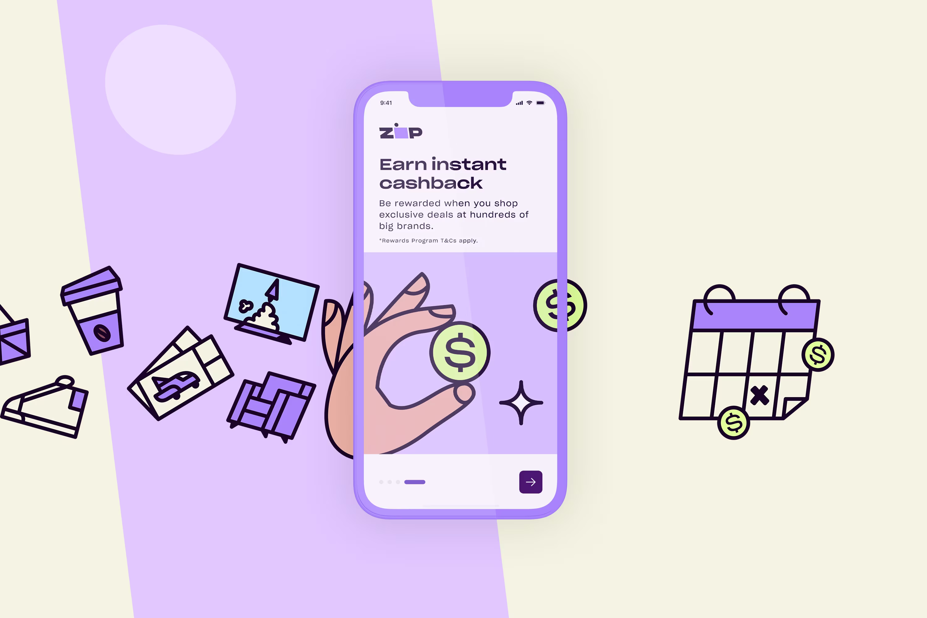
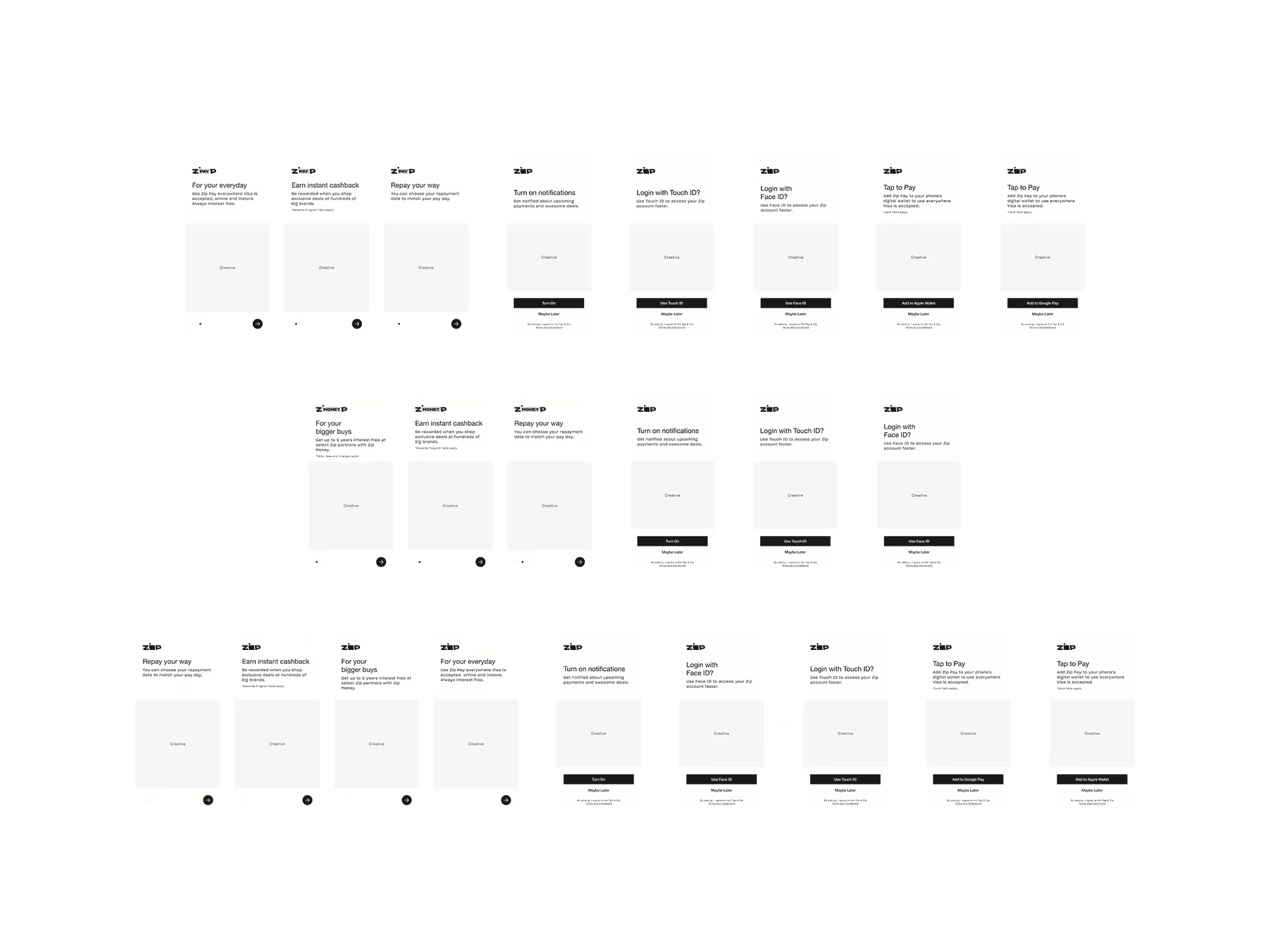
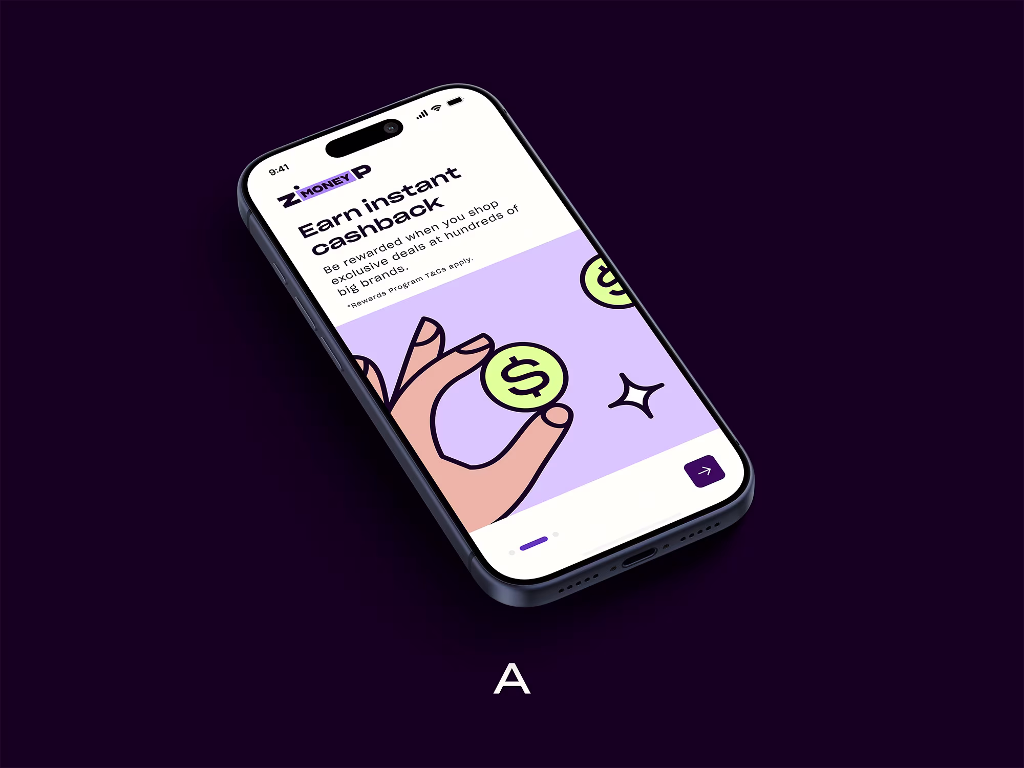
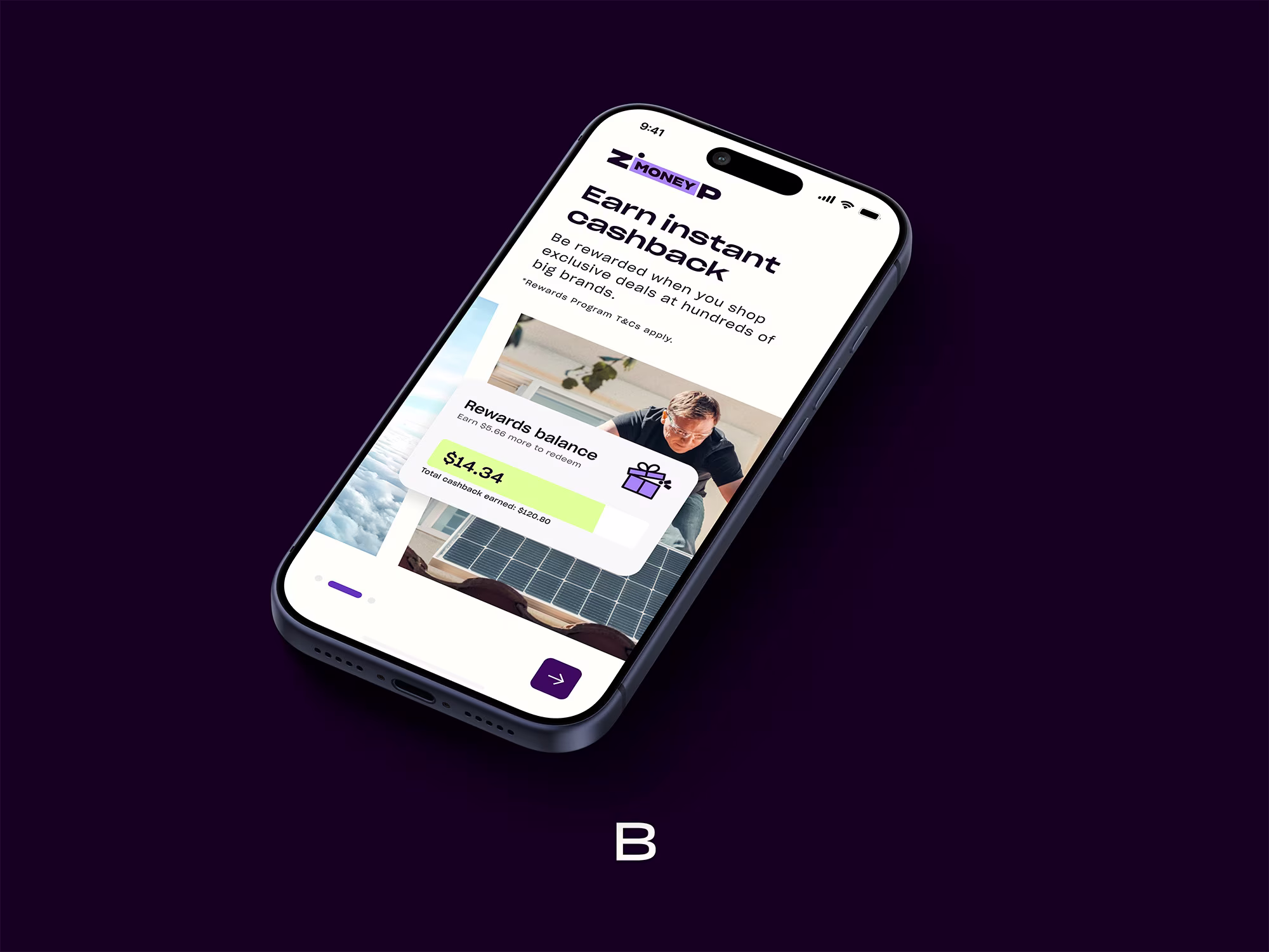
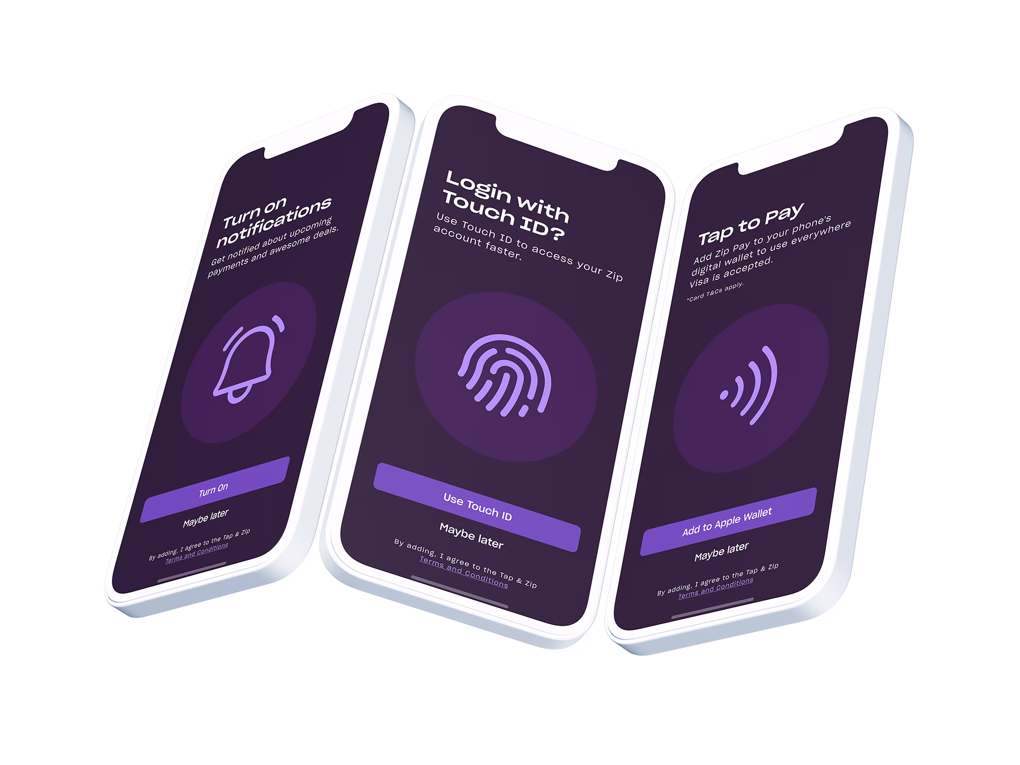
The design and UX for both options remained similar in structure. I created a visual that represents the four stages of the flow: everyday purchases (coffee), bigger purchases (holidays), cashback (coins), and repay your way (calendar). There were three flows, depending on which product the user was more likely to use: Zip Money, Zip Pay, or both.